In our three part series “Scientific Writing” we cover aspects of writing, creating good looking plots, and generating meaningful graphs from data. In the first event John Brown pointed out mistakes commonly made by non-native speakers when writing scientific documents. The second talk “Writing Beautiful Documents with LaTeX” by Alessandro Crismani gave a brief introduction to TikZ. The talk was motivated by a common problem when writing documents in LaTeX: How does one get the figures to have the same font and size as the rest of the document. This article briefly illustrates the possibilities of TikZ as we assume this problem to be wide spread.
PGF/TikZ is a tandem of languages that can be used in a LaTeX documents for creating beautiful drawings. Using PGF/TikZ the fonts used in graphics are directly plotted with Latex, and hence they scale accordingly to the text size, unlike EPS files exported, for example, from Matlab.
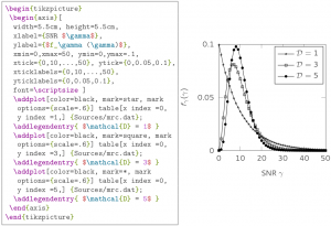
The short talk presented a funny introduction to PGF/TikZ, explaining by examples how to use such languages for producing drawing for everyday publications. The talk explained how to create a nice plot from a saved series of data, such as this one:
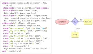
Or, if one is rather a flow chart guy, the talk also showed how to draw very content rich charts, such as this:
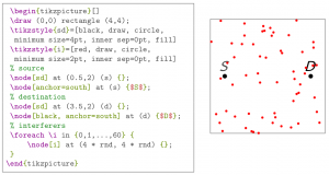
Finally, for the mathematical inclined people, the icing on the cake was learning how to plot random coordinates and to use intersection between curves:
You may download the slides (pdf) or check them out including the examples from BitBucket using git.
We continue our scientific writing series on another problem students and researcher face: how to obtain meaningful plots from data in July.